
Black Orbit
Recordings
Black Orbit Recordings is a start-up independent German record label releasing underground Techno and House music from artists around the globe. Their focus is on pushing a non-commercial sound and nurturing new and emerging talent that fit this ethos.
About The Project
Branding and Print Design
Black Orbit Recordings approached me to work on their logo and print items. As a start-up record label there was a clean slate to work from and I could design everything from the ground up.


Solution
In my process every logo project starts with a conversation with the client where I find out all about their business, competitors, vision and more so that I can formulate a clear set of objectives to be able to design to. This part of the process helps me fully understand their business, the industry landscape and define a brief to work towards.
During this discussion the Black Orbit Recordings founder discussed the fact that he was a gardener during the day and that the idea of something organic looking could work well as it represented part of him. We agreed that I would try something with an organic element as part of the initial development stage, whether it be a plant, flower, tree, leaves etc was up to me and also include an orbit element – one good thing about the music industry is that it generally gives you a bit more creative license than when working with a corporate client so there was lots of room to explore some cool ideas.
I went away and worked on some concepts that matched the brief and the ideas that the founder gave and presented them to him over a video call; below shows two pages extracted from the presentation which show the thinking behind the concepts.
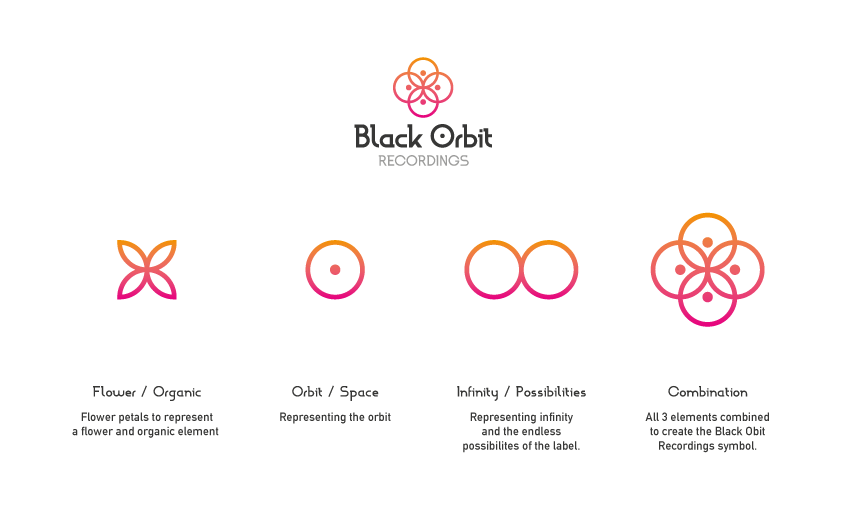
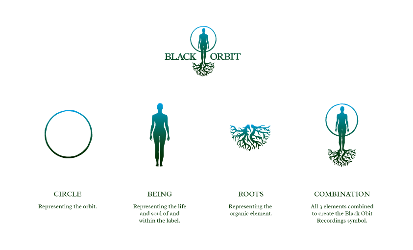
Although he loved what I had designed and agreed that I had hit the brief, after seeing them he felt that he wanted to move away from the organic side showing the flower in option 1 and the roots in option 2.
We decided that the best way to move this forward was for him to provide me some inspiration for what he had in mind. As mentioned above he wanted to move away from organic elements and sent me the below images, one representing how he described as an abstract planet/sun with sections coming out like rays and the other was clocks and cogs, here he loved the symmetry of the cogs and the silhouette they produced and we discussed that this kind of shape would look brilliant on vinyl record stickers that would spin when the record is played on a turntable.

I went away and worked on some ideas and presented them back to him with the final logo that you see in this case study included and he was over the moon with the outcome and that we were able to work together in this manor to create a logo that he felt was now perfect for the label.
This project shows that we don’t always get it right first time and that sometimes you need to change the course of direction to get to the solution best suited for the job. The client understood that if he had been clearer in defining his ideas from the start we would have arrived at the end solution sooner but I think what matters here is that we got there in the end.
Since designing the logo it has been published in the long running logo book series Logo Lounge, which is a logo gallery book that features logos judged and selected to be included by some of the worlds most famous logo designers which was the icing on the cake for the Black Orbit Recordings project.
Feedback
“Liam did a great job working on the new Liquid V logo for us. Taking the existing branding and reworking it into a fresh new concept, whilst taking into consideration all the different (and sometime competing!) factors in the brief we gave him. This new branding has since been rolled out across all our releases and merchandise.”

Comments are closed.